Nasıl Yapılır - Bir Görüntüyü Çevirme
CSS ile bir görüntüyü nasıl çevireceğinizi (ayna efekti ekleyeceğinizi) öğrenin.
Farenizi resmin üzerine getirin:
Bir Görüntü Nasıl Çevrilir
Örnek
<style>
img:hover {
-webkit-transform: scaleX(-1);
transform: scaleX(-1);
}
</style>
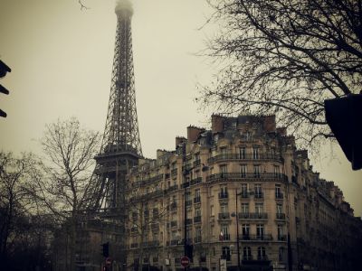
<img src="paris.jpg"
alt="Paris">
Not: Bu örnek tabletlerde veya cep telefonlarında çalışmaz.
İpucu: 3B dönüşümler hakkında daha fazla bilgi edinmek için CSS 3B Dönüşümleri Eğitimimize gidin.
Metin ile 3D Flip Image
Metin içeren bir görüntünün animasyonlu 3B çevrilmesini nasıl yapacağınızı öğrenin:
Paris
ne muhteşem bir şehir
Adım 1) HTML'yi ekleyin:
Örnek
<div class="flip-box">
<div class="flip-box-inner">
<div class="flip-box-front">
<img src="img_paris.jpg"
alt="Paris" style="width:300px;height:200px">
</div>
<div
class="flip-box-back">
<h2>Paris</h2>
<p>What an amazing city</p>
</div>
</div>
</div>
Adım 2) CSS'yi ekleyin:
Örnek
/* The flip box container - set the width and height to whatever you want. We
have added the border property to demonstrate that the flip itself goes out of
the box on hover (remove perspective if you don't want the 3D effect */
.flip-box {
background-color: transparent;
width: 300px;
height: 200px;
border: 1px solid #f1f1f1;
perspective:
1000px; /* Remove this if you don't want the 3D effect */
}
/* This
container is needed to position the front and back side */
.flip-box-inner {
position: relative;
width: 100%;
height: 100%;
text-align: center;
transition: transform
0.8s;
transform-style: preserve-3d;
}
/* Do an horizontal
flip when you move the mouse over the flip box container */
.flip-box:hover .flip-box-inner {
transform: rotateY(180deg);
}
/* Position the front and back side */
.flip-box-front, .flip-box-back {
position: absolute;
width: 100%;
height: 100%;
-webkit-backface-visibility: hidden; /* Safari */
backface-visibility: hidden;
}
/* Style the front side (fallback if
image is missing) */
.flip-box-front {
background-color: #bbb;
color: black;
}
/* Style the back side */
.flip-box-back {
background-color: dodgerblue;
color: white;
transform: rotateY(180deg);
}